Case Study
Site architecture and responsive redesign
Role
UX Researcher
Information Architect
UX/UI Deisgner
Year
2018
The Project
We were tasked with researching The Container Store's current website architecture and layout and proposing an alternative solution that paralleled the physical in-store experience.
The Challenge
The Container Store opened its first physical location in 1978. It specializes in providing people with a myriad of storage and organizational products, and its in-store experience is one of ease and inspiration. Users, however, found their digital presence did not match the experience they came to expect when visiting a physical location.
Two other UX Designers and I conducted research including contextual inquiries, user interviews, usability testing, and card sorting. Armed with this initial research, I ventured off alone to design an updated product, connecting the Container Store patrons' in store expectations to their digital experience.
How might we enable people looking to organize their lives to take an organized, intentional, and efficient approach to their shopping experience?
Research
The Container Store has a broad, dedicated user group and customer base. We wanted to learn two main things from our users: what do they like - what drives them to shop at the container store - and what are their frustrations.
Where Does The Container Store Fit?
In order to understand The Container Store’s customers we conducted research to see where it fit in the market. The Container Store specializes in providing inspiration and solutions to everyday storage problems. A typical container store customer is generally upper middle class, urban, and young to middle aged. People also use the container store more around big life events (ie weddings, birthdays, baby showers) making the gift registry very important to them.
Contextual Inquiry
In order to learn more about The Container Store’s customers’ habits, we conducted contextual inquiry at their flagship store on 6th Ave in New York City.
User Testing
To understand the User’s Experience while navigating The Container Store website, we conducted several rounds of testing. Since many people go to the container store to find gifts, we asked people to find a specific gift registry, select a gift, and checkout.
Personas
Using the what we learned from our user interviews we created imaginary user personas to help us stay laser-focused on the people for whom we were designing.
User Journey
We made a user journey to understand how Justin felt as he navigated his The Container Store experience. He found it frustrating that he could not easily find the gift registry and had to leave the site, Google “The Container Store Gift Registry” and then re-enter the site.
Information Architecture
Currently, the architecture of The Container Store website confuses users. There are four sections for people to choose from, but if they are looking for a specific item, they are unable to easily locate the product.
User Flow
We mapped a typical user’s journey through the site to understand the steps a person would take in order to find a gift on a registry, select it, and checkout. On average it took a person about three minutes to perform this task, and they had to move through twelve different screens.
Key Research Takeaways
Heuristics Analysis
We conducted a heuristics analysis to understand the main areas that needed help. We found that The Container Store site needed to be more clear, controllable, and learnable.
Focus Areas
Using the information we gathered during the research phase, I identified main focus areas for the redesign.
Reorganize and redesign the header
Clarify and reorder the body content
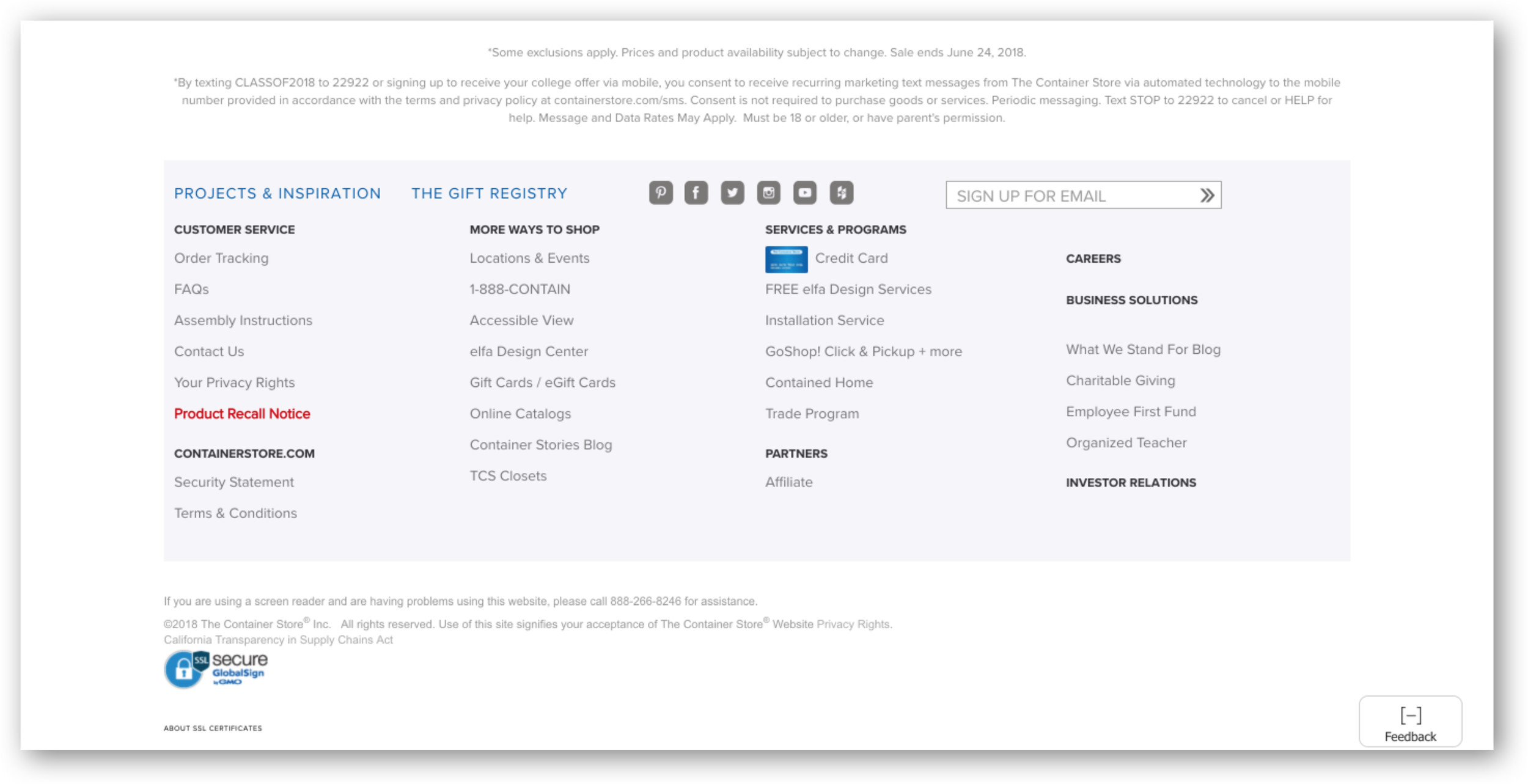
Rearrange the footer and relocate the location of the “Gift Registry”
Solution
Reorganize and redesign the header
I simplified and clarified the header and added the “Gift Registry” to the top of the page.
Clarify and reorder the body content
I clarified the body content to highlight the most important features first, and help people easily access popular and promoted products.
Rearrange the footer and relocate the location of the “Gift Registry”
I moved took out the “Gift Registry” from the footer, people were confused and upset when looking for the registry during user testing.
Design
As we moved into the design phase we used the information we learned through our research to inform all our design decisions.
Information Architecture
I reorganized the site architecture in order to make products and features more accessible to users. This consisted of adding a new section with drop down menu for “More Ways to Shop,” moving the “Elfa” section into the “More Ways to Shop” section, and reorganizing the “Shop All” departments into fewer, more understandable sections.
Prototyping and Iterating
I ran through several rounds of usability testing to help me design the best product for users, and The Container Store. From the existing site to the proposed site the time spent on specific tasks decreased greatly. With the redesign people are more quickly able to find what matters to them.
From the first usability test of the existing site, to the last usability test of the prototype the time spent on task decreased dramatically. By implementing my proposed changes, users could expect to save over a minute completing certain tasks, as compared to the current site.
What Comes Next?
The Container Store website contains a large number of products to help people find storage solutions and become better organized. But because there are so many products, it is important to focus on clarity in the overall organization of the site. My next steps with this project are:
Usability Testing with people who represent our users more closely.
Run another round of Card Sorting in order to ensure that the new categories are as clear and usable as possible.
Research the goals of the company more closely in order to highlight features and products that create greater revenue, while balancing the needs of the user.


